911+
Emergency and non-emergency numbers at your fingertips no matter where you go
OVERVIEW
Concept mobile app helping people find the right emergency or non-emergency services abroad or at home
911+ is a mobile application taking the guesswork out of getting the right help, right when you need it. On this side of the globe we’re all familiar with calling 911 in an emergency but, what happens when you’re abroad and 911 isn’t the answer? This concept mobile app aims to solve that problem, so emergency or not, you’re always prepared.
Role
Visual Design
UX/UI
Interaction Design
Branding
Team
Team of 3- Lead Product designer (Me)
Tools
Figma
Miro
Google suite
Duration
3 weeks
Nov 2020
Deliverables
20 screen mockups
Semi-interactive prototype
Understanding the problem space
The absence of a universal number to call or text in the case of an emergency, poses a big problem to tourists who happen to find themselves in situations requiring some sort of assistance
Emergency services are crucial in every society around the world to help us in our gravest times. However, each country has a different number to contact for emergency and non-emergency related services. . Although no one ever plans to be in an emergency situation abroad, the old adage of “it’s better to be safe than sorry” rings true - and having easy access to the information of emergency or non-emergency numbers for various cities/countries, could save precious time in a crisis, and also possibly save lives.
calls are made to 9-1-1 in the U.S. each year
of the calls made are from wireless devices
Exploration into our target audience and what drives them
Speaking with users within our target audience uncovered 2 main themes which laid the foundation to begin brainstorming and solutioning
In order to learn more about this problem space 5 interviews were conducted with individuals who have had experiences utilizing emergency or non-emergency services abroad or at-home, to learn more about their thought process and common pain points when using these services.
Main themes from interviews:
Theme 1
Searching up the emergency or non-emergency numbers of a destination prior to traveling, isn’t a common practice amongst travellers - they want to avoid memorizing or think an emergency is unlikely to happen
Theme 2
People aren't confident in differentiating a non-emergency situation from an emergency situation; and default to call emergency services if unsure
The user interviews conducted helped shed light on our target audience and inform the behaviours, goals and frustrations of the primary and secondary personas used to guide our ideations
From the interviews conducted I formulated 2 personas (one representing our primary user- tourists and one representing our secondary user- locals) to help empathize with the frustrations, needs and goals of our target end-users and make sure the solution is aligned with solving their pain points.


How might we...
1. Design a product that presents emergency and non- emergency service numbers in an easy and digestible manner?
2. Design a product that streamlines the process of finding the right service number to call, so as to save time, energy and resources?
Defining the solution
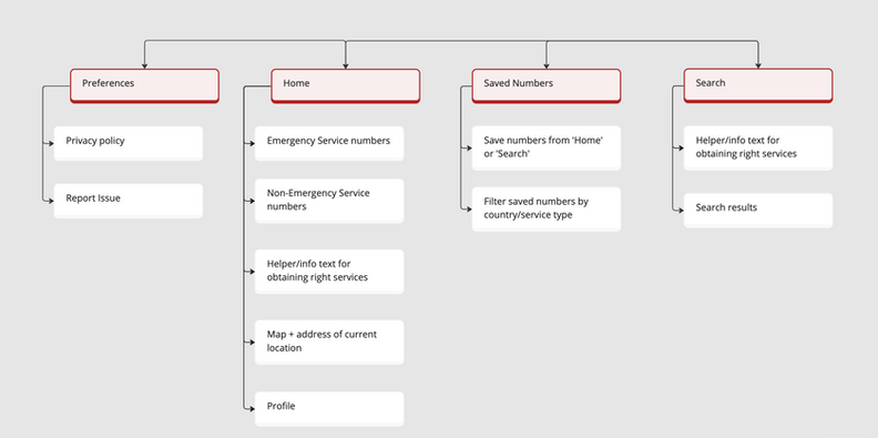
Since user’s generally use their mobile phones when calling for help, we moved forward with brainstorming tasks that would inform features for a mobile solution and mapped out the information architecture for how these features would interact within our app
Keeping Liza and Timothy in mind I drafted 9 user stories to define potential tasks that our target users could perform in order to alleviate their pain points and prioritized the tasks for the mvp in order of relevancy to the two main themes uncovered during interviews.
(Click image to enlarge) Table with prioritized user stories for 911+ app
(Click image to enlarge) High-level information architecture of app content
Sketches for exploration of home screen variations
The home screen is where the crucial actions for our users takes place so it was important to get the best version that created the most seamless experience in the context of an emergency.
I decided to go with version 3 because it had the best balance between a simplistic navigation, an uncluttered ui that doesn’t distract users from their main goal and engaging ui elements (ex. interactive map)
(Click image to enlarge) Annotated sketches of home screen variations
Outcome
I created high-fidelity mock-ups to tie together the research, brainstorming, and sketches and bring to life the 911+ brand look and feel.
Task flows + High-fidelity screens
Below are the final high-fidelity screens for the app, with a focus on the screens where users will perform the main tasks of :
-
Pin pointing their current location + choosing and dialling the local emergency or non-emergency service
-
Deciphering when to reach out to emergency services vs. when to reach out to non-emergency services
-
Manually searching the emergency or non-emergency contact details of any country


